4.29.2009

Phreaky Wednesday (thought it was Phriday!)

Okay, saw this today on Smart Bitches, Trashy Books and just had to had to HAD TO post it for your enjoyment. Sorry for the size of the picture, but look at the size of this guy's...ummmm...turret!

Hung like a horse??

4.27.2009

Mammary Monday: Goth Edition


Thanks to Larry, who sent me this cover, I now look at this kinda cool goth cover and see kiddy porn. Anyone with me? Yeah, some folks over here: http://www.orbitbooks.net/2009/02/23/cover-launch-tempest-rising/
(the editor (?) tries to defend it by saying she's too "curvy" to be a kid but, damn, this could be a cover for Lolita, yo!)

4.25.2009

In a shameless theft from Retrospace, I present to you Heloise's Work and Money Savers:

Zombies have stopped craving brains, and are now trying to get us to recycle. I just love how they've paginated the title to fit her head. I feel like there should be another word in there hidden by her '70s hair. What word could it be, do you think?

4.24.2009

Phallic Earth Day (a little late)

Thanks to Tom, who sent me this cover, I now see phalluses in innocent little water bottles...turgid little water bottles...with glistening droplets, um, glistening...Oh, just look at this cover!


4.22.2009

Dinner anyone?

I'm not going to snark on this cover because I think it is the funniest title I've ever read!! It's satire (which I love), and I may just have to pick it up!! BTW, I stole the idea from the fail blog (failblog.org), who had it posted this morning.
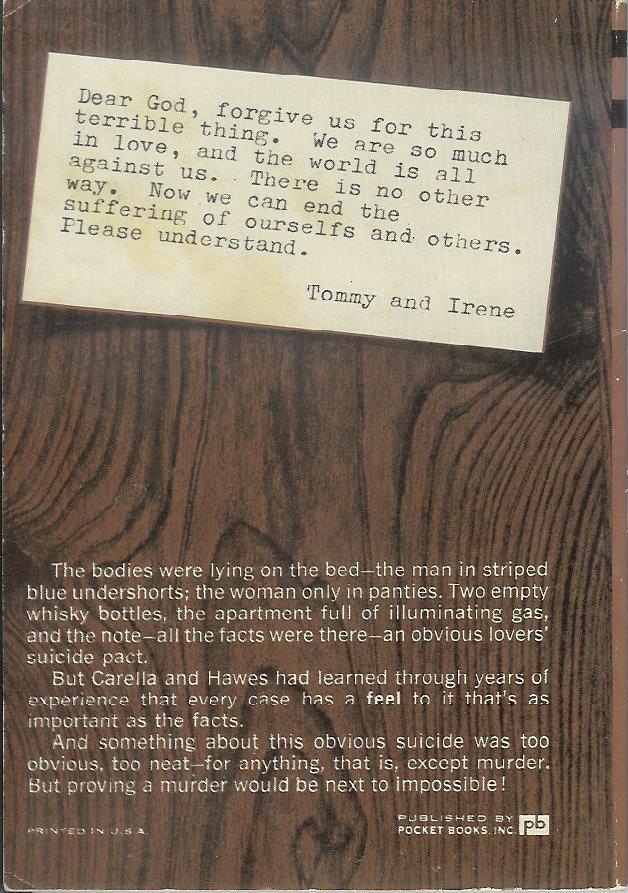
4.21.2009

Save the anonymous male.


This book discusses how the feminist movement went beyond its original aim (of bringing equality to women) to the point of minimizing the importance of men and masculinity in families,relationships, and society. It actually sounds rather interesting.
What amuses me is that this is yet another cover that anonymizes someone. Ok, I get the argument about the autism book (the boy with no lower face), but if this book is about the importance of men, why cut off his face? Not to mention that the block of white with the title and subtitles is just ugly and unimaginative (in my oh-so-humble opinion). And why is it all spread out that way? They should have made the white square smaller or the subtext bigger. Just annoys me.

4.19.2009

Sultry Sunday #27 - the weekly "Pop Sensation" crossover

Hey all. Rex Parker here, back from a little vacation (Costa Rica), and ready to drop some more fresh vintage covers for you all once again. Let's see ... yes, this will do:

Paperback 221: Permabooks M-4289
(1st ptg, 1963)


Title: Like Love
Author: Ed McBain
Cover artist: Robert McGinnis


Best things about this cover:

  • "Dear God, please let me score with this chick from Cirque de Soleil. Amen."
  • "Dammit! Why won't my eyebrows stay *down*!?"
  • "Man, my thumbnails look *weird* up close..."
  • "Oh, Steve, I'm tired of you and your shadow puppets. Can't we just get back to hanging drapery?"
  • What the hell is with the title?: "It's *like* love, baby, just ... minus all the caring and sharing and listening to your damned problems. OK?"
  • This will sound odd, but the softness of the coloring and the fine pattern on the wallpaper reminds me of John Singer Sargent portrait that I love.

Best things about this back cover:

  • Tommy and Irene - sounds like a one-hit wonder pop duo from 1963
  • Carella and Hawes - sounds like a crime-fighting duo from 1974
  • "ourselfs" - ouch
  • Authentic imitation wood paneling! Really, one of the awesomest design choices in modern back cover art history

Page 123~

"Miscolo!" he yelled.
"Yo!" Miscolo yelled back from the Clerical Office.
"Bring in some iodine and some Band-Aids, will you?"
"Yo!" Miscolo answered.

~RP

4.15.2009

It's all fun and games until someone loses an eye!

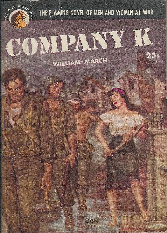
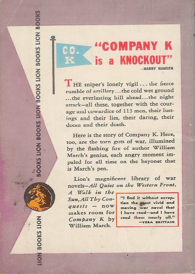
Nothing can come close to competing with Maughta's last cover. That was stunningly bad, and a clear winner in any phallicky cover contest.
My last couple offerings haven't been too well received, but hopefully this one will be more agreeable (in a disagreeable way).
Here we have what looks like a middle aged or older guy throwing an anthropomorphic figure into the air. Why? Does he think the kid likes it? Maybe he mistakes her screaming for laughing? Of course, it could be a doll, rather than a kid. And maybe my assumption that he threw it is wrong, and it actually just fell out of the sky. Hmmm, maybe falling out of the sky wouldn't be any weirder than throwing it that high up in the air in the first place. Especially if it's a child.
Of course, it's possible I have it backward and it's actually a kid floating away, tied to balloons that are already out of the frame. THe guy is watching her disappear into the cloudless sky, to land who-knows-where and suffer who-knows-what fate.
Or, I suppose it could even be an alien predator coming down from a spaceship to attack this poor defenseless man who was minding his own business and just walking on his lawn, looking for dandelions and eyeing the punk kids across the street who like to pee on the side of his house when he isn't looking. Now he's going to be devoured by a monster from outer space. Very sad.

4.10.2009

Phriday Hall of Phame (and Shame!)

I...I just don't know what to say about the following cover, sent to me by the kind people at Powell's Books* in Phort...erm, Portland. It is the most phallic cover I've ever seen (and, let me tell ya, I've seen a lot of phallic covers!). Every single element in this cover is phallic. As Dot from Powell's put so aptly, "may I present to you the hairy vulgarity of Neal Barrett Jr's Stress Pattern."


Also from Dot:

I think that the detail that inspires the fiercest unholy shuddering, personally, is those tufts of wiry pubic hair wriggling out from the beast itself. But yes, I could envision this cover as a Highlights magazinesque "How Many Phalluses Can You Spot? Find and Circle Them All!" feature.


Personally, I'm finding the little guys who are shaped like penises to be the most abhorrent, myself. Or maybe the human's hat?


*Powell's is an awesome bookstore that earns the seal of approval of this blog. Yay, independents! Beat off the one-breasted bitch!


4.09.2009

Maybe this kid is really ugly. Maybe he was born without a nose or mouth. Maybe his skin is inside out on all parts of his body other than his arms and upper face. Maybe he fell down just as this picture was being taken. Maybe the photographer fell just as this picture was being taken. Maybe... ok, I've run out of possible reasons for showing nothing but the kid's upper head and arms.

Maybe Daniel isn't talking because you didn't think his mouth was important to the cover of the book.

4.07.2009

What could this be about?


I find this cover uninspired and goofy. Yes, it has the "wonderful" Mona Lisa (whose lack of eyebrows I've always found kinda freaky), a classic of Italian Renaissance art and most famous resident of the Louvre. But that big fat orange question mark strikes me as very silly. Hmmmm, what could this book be about? Without looking at the title, one would guess it is about the identify of the model. One would be wrong.
The title (you really have to squint to see it) is Vanished Smile: The Mysterious Theft of Mona Lisa. It tells the story of when the painting was stolen from the Louvre in the early 1900s, which sounds like an interesting read to me. I just find the cover so boring -- a clash of the sublime and the stupid. Maybe I just hate orange?
Anyway, an interesting factoid is that no one noticed the painting was gone for a full 24 hours. I'm sure some visitors to the Louvre would have assume that it had been removed for cleaning or restoration or something, but you would think someone would have asked. Maybe they didn't have any security guards back then. Or, more likely, the guards were French, and no one is afraid of the French. See the video below for proof. (By the way, I'm 1/4 French, so I have at least some standing to jokingly bash the French.)

4.05.2009

Sultry Sunday #26: the weekly "Pop Sensation" crossover

Happy Sunday - here's your Pop Sensation crossover post. It's not the sultriest of covers, but it'll have to do...

-----


Paperback 215: Lion Books 111
(1st ptg, 1952)


Title: Company K
Author: William March
Cover artist: Rafael DeSoto


Best things about this cover:

  • DeSoto is one of the great naturalistic cover artists, and this cover is really expertly painted. Beautiful, detailed, evocative of the suffering of war. I'm finding this cover slightly hard to make fun of. Although ... if her stroking and pumping that giant lever isn't innuendo, I don't know what is. That is, if "she" is indeed a woman. The novel is, after all, "flaming."
  • I'm afraid of the guy at the front of that line. He looks like he's lost all hope ... or else he is a golem or a droid or something.
  • "The Flaming Novel of Men and Women at War" - sounds like a book about the battle of the sexes. "Men Are From Mars ... : WWI Edition!"

Best things about this back cover:

  • "Company K is a Knockout"! Letter play not so effective when the "K" is silent. "Company G is a Gnat-infested Gnightmare"
  • This back cover is in Love with alliteration. Courage and cowardice ... lustings (!?) and lies, daring, doom, and death.
  • It's appropriate that this book is somewhat purple, because check out the prose in that second paragraph. March impales angry moments with his bayonet-pen!?
  • I like the little flag, particularly the wacky font of the letters.

This is a pretty famous and well-received novel of W. W. I, organized into micro-chapters about every single man in the company. Blurbs inside from Granville Hicks, Graham Greene, James T. Farrell, and Phyllis Bentley (whoever that is).

Page 123~

On Monday a kid from my company named Ben Hunzinger got fifteen years hard labor for deserting in the face of the enemy, and a long talk from Mr. Fairbrother about justice tempered with mercy.


Whoa, "Mr. Fairbrother?" Is this an allegory?

~RP

4.03.2009

Phriday again!

Happy Phallic Phriday everone!

My first, second, and third reaction to this cover is WTF??? It's just wrong on so many levels. First, it's called "Touch Your Toes" and he's not even trying to do that. Second, it gives a date range, like he's someone we should know and care about, and as if this date range should have some significance to us. Third, I can't tell if that's a modesty dot or if he's straddling a doorknob. Seriously, I can't tell.

I did some research and I guess Baer is a photographer obsessed with having naked men reach for their toes. This is volume 1. There's a sequel. By the way, neither the cover nor the reverse shows a man touching his toes, even though that's what Baer was striving for. Oh, and to answer my own question above, it IS a modesty dot. If you use the "random page" feature of Amazon, just be aware that it's Not Safe For Work (well, depending on where you work, of course!).

Maybe I'm not artsy enough, but I find this kind of repulsive. Don't get me wrong, I love the male body, but this is just creepy. Thoughts?

4.01.2009

blurb smurb

Okay, so the cover isn't all that horrible, but I'm just ferklempt at the blurb.


If you can't read the fine print, it says

"It's unlikely you'll read a more unusual novel this year."


In what way can you possibly parse this to make it a good thing?!?